


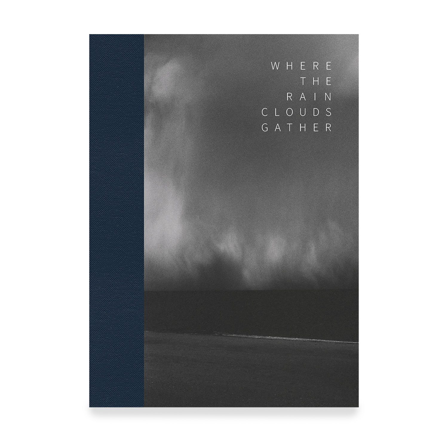
Where the Rain Clouds Gather Posted On 25th April 2021 To Magazine & Stories

In this blog article, Kit Young provides insight into his latest book, Where the Rain Clouds Gather (OD Books) , which was made entirely from scanning hand-made silver gelatin prints.
The Concept
At times the past year has raced past in a haze. Streets have emptied and we have retreated to our cocoons. Cooped up. Waiting for the storm raging outside to subside. The images in Where the Rain Clouds Gather, my second publication, appear as if from a dream state. Moments in time, brought to life in the darkroom and weaved together to create a journey.
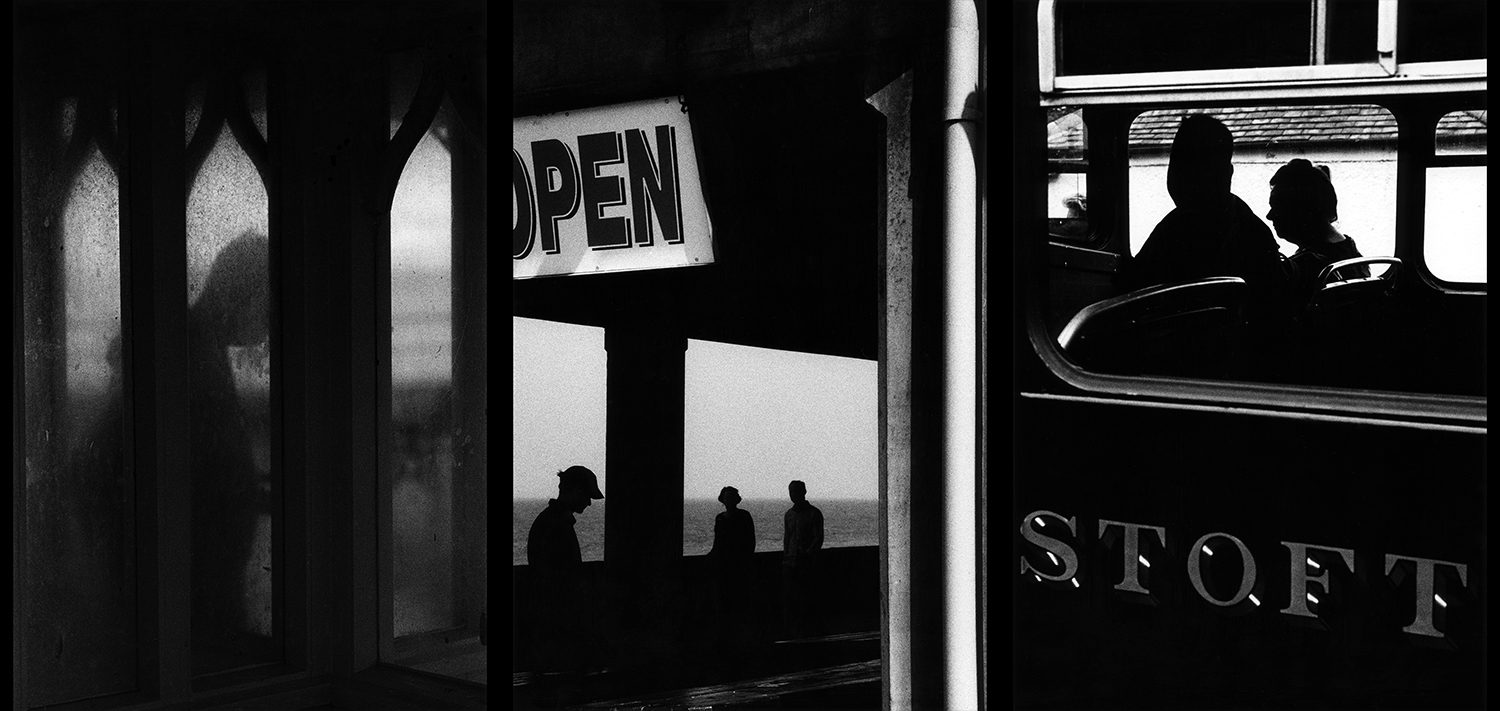
Where the Rain Clouds Gather is a visceral memory of a trip taken under more certain skies. Following characters as they wait with anticipation for their journey to begin in quaint coastal bus shelters and steam plumed train stations seemingly from another time. Out and into elements. Flashes of the sea flicker through windows as we wind along glistening pathways. Stopping only to soak up the epic vistas under blackened and tumultuous skies. Those characters have become silhouetted ants now. Visible in the distance. Almost indistinguishable from the rich veil of grain that adorns each scene.
The Photographs
I began shooting work for Where the Rain Clouds Gather in 2013 when I had just moved from Paris to Norfolk. Back then, I would head out to the coast every week, visiting bustling seaside towns for the urban work and exploring more remote coastal destinations for the landscapes. The contrasts of the urban and landscape environments have always captivated me: restricted vs. expansive, proximal vs. distal, populated vs. uninhabited. I think, ultimately, I look to catch glimpses: urban photographs that are perhaps incomplete in some way — obstructed views, distorted subjects, unidentifiable protagonists — and landscape photographs that teeter on the very edge of the naturalistic and look into more abstract ways of exploring shape through tone.
I felt it important to include a range of work, both urban and landscape, spanning several years. I think it’s compelling to show the multiple facets of how one sees – a body of work – and in a certain sense the visual vocabulary is richer and, I hope, the end result is more fluid too. For some of the earlier work in this book, particularly the photographs shot in 2014 and 2015, several years of thinking and testing, under red light, were required to unlock the negatives and find the images as they are presented to the viewer in this new book. So, the photographs lay dormant for some years until I could work out what to do with them as a printer.
The Darkroom
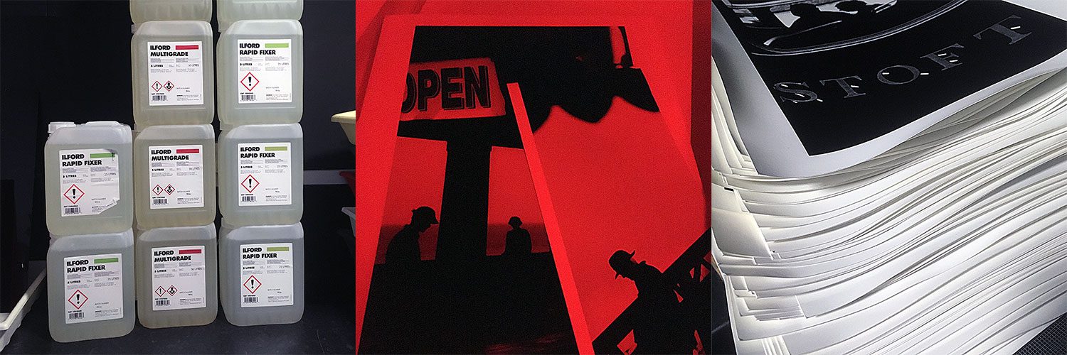
It is a conscious decision to only work with hand-made silver gelatin prints when sharing my work – be that in books, for exhibitions or online. I consider the hand-made silver gelatin print to be the final manifestation of my vision and I truly believe in the power of photographs as tangible objects. Each silver gelatin print I make will always be unique in some way; each print has its perfect imperfections. It’s a lot of hard work and, generally speaking, a slow process but it’s an incredibly rewarding one too.
I consider myself to be a photographer and a printer. I think that’s an important distinction to make. I don’t just take photos; I make photos too. The photographer in me is responsive, impulsive, reacting to subject matter on the spur of the moment, more often than not giving very little thought to anything more than the lines and tone of what’s in front of me; the printer in me is methodical, exacting, always working in a more meditative way. I do, however, think that both the photographer and printer in me are curious, inquisitive and often playful – and neither is afraid to make mistakes.
The Series: Sequencing
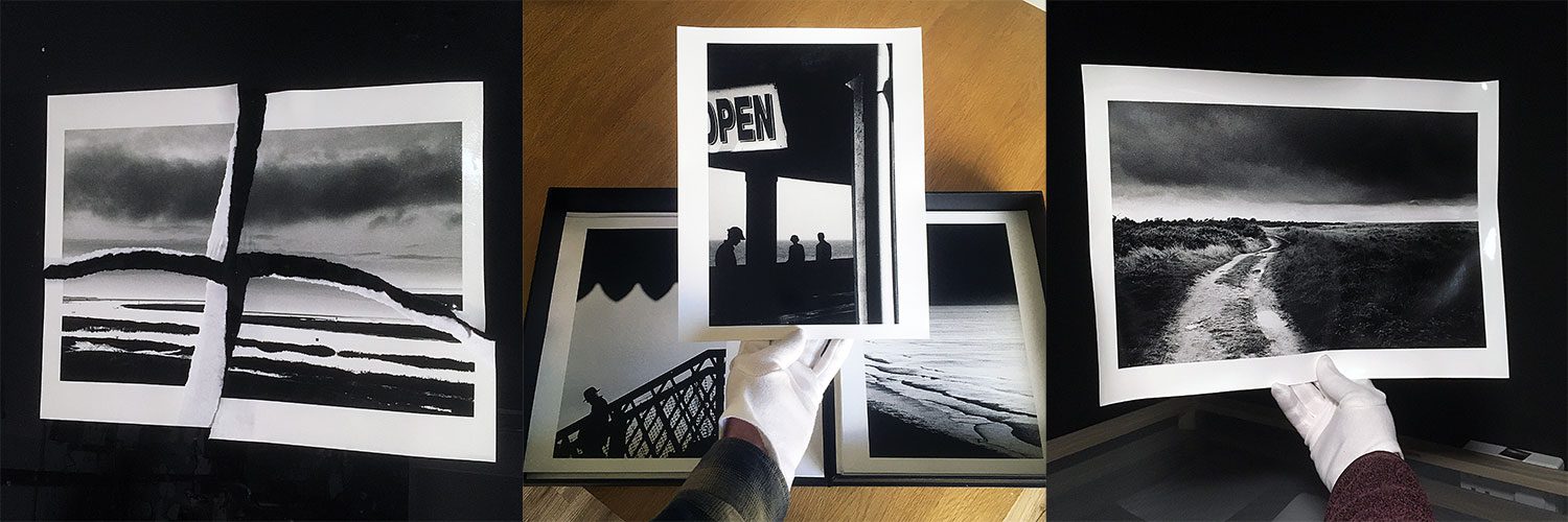
When it came to working with the publisher, OD Books in London, I first sent (very) rough scans for the purposes of exploring the concept and sequencing of the book.
The final sequence took some time to perfect and all credit has to go to Tom at OD Books for doing such a stellar job – he was able to make connections and associations that I could never see. I think this is one of the most beneficial things of working with a publisher and unleashing a fresh set of eyes on the work. The whole process holds many a revelation and inevitably offers up new ways of perceiving and understanding the work too.
The Prints: Perfecting and Finessing
With the sequence set, it was immediately clear to me that all of the prints I sent to the publisher needed re-making: either they could be improved, tweaked, or else I was going to have to work out how I achieved a given result, particularly the older ones for which there were no printing notes.
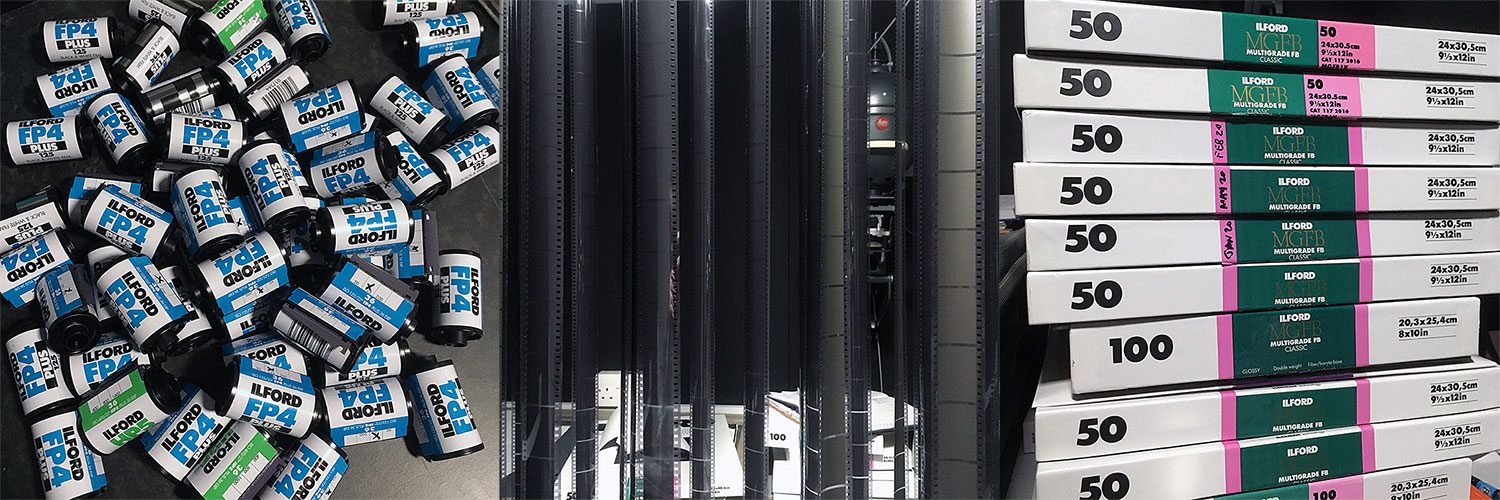
For the prints requiring slight adjustments to be made in the darkroom, I mainly focused on ensuring the consistency of tone (and grain) between prints so that the viewer is able to latch on to and dialogue with a consistent visual language. This, I think is very important, particularly in this case where I was drawing on seven years of work made with a wide variety of materials, with film stocks such as Ilford FP4+ and HP5+ pushed in various ways; and developers: Microphen, LC29, ID-11, DDX. In some instance, the concept of the book and the fact that it is to be printed using metallic ink on black paper actually ended up informing my printing choices in the darkroom.
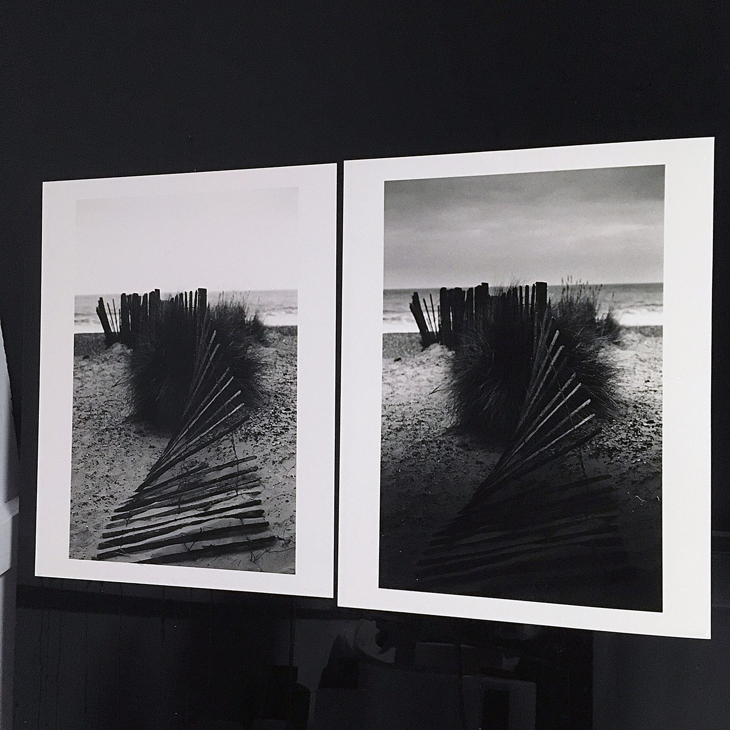
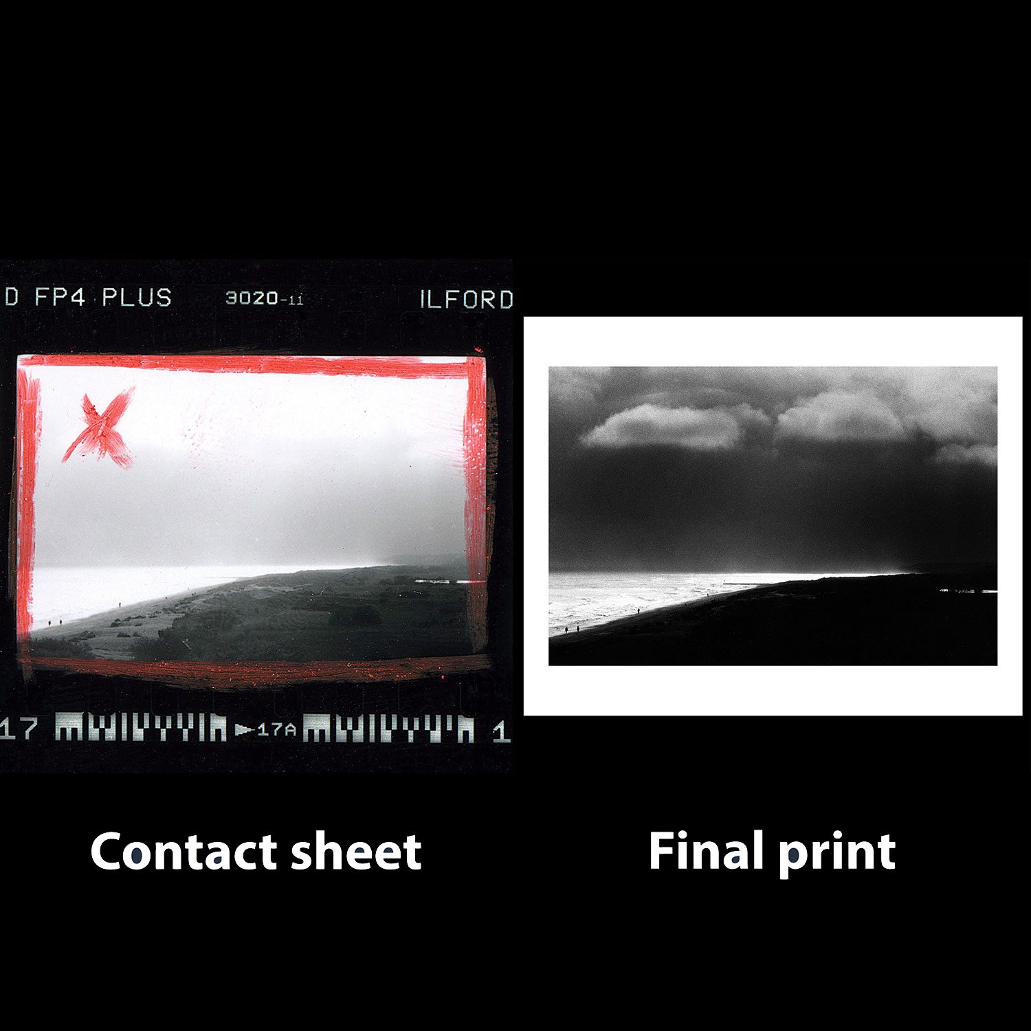
For the photograph above, Beach (2015), I took the version of the print I had originally made in 2015 (left) as a starting point and decided to push the darks and the lights a bit further with the re-interpreted final print for the book (right). Indeed, I was keen to establish a more distinct dialogue between the materials used for the book: the silver ink, for the lights, and the black paper, for the darks. Presented side by side like this, the final print does appear to be a rather radical re-interpretation, but I still think it’s a successful aesthetic choice and it will serve the book well.
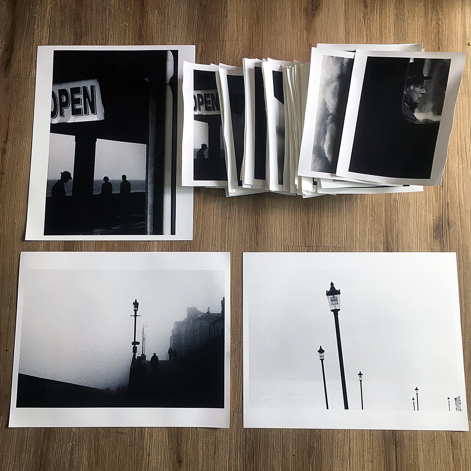
Regarding the photographs for which no printing notes existed, well, if these photographs were going to be used in the book, and if the prints were going to be exhibited, I first had to work out how I made them. I gathered the old contact sheets and the old prints I had made and started to work backwards: first looking at the final print and then imagining how I could’ve got the result. Lots of tests then ensued – weeks and weeks of very long printing sessions to complete the final prints, ensuring that they communicated with each other effectively in terms of tonality. In all, I spent well over 200 hours making the 44 photographs for the book and I got through close to 700 sheets of 9.5x12” Ilford MG FB Classic paper in the process. I think it’s important to always be demanding in the darkroom and to ensure that only good prints leave intact. In the darkroom, time is always on the printer’s side so there’s no need to rush things.
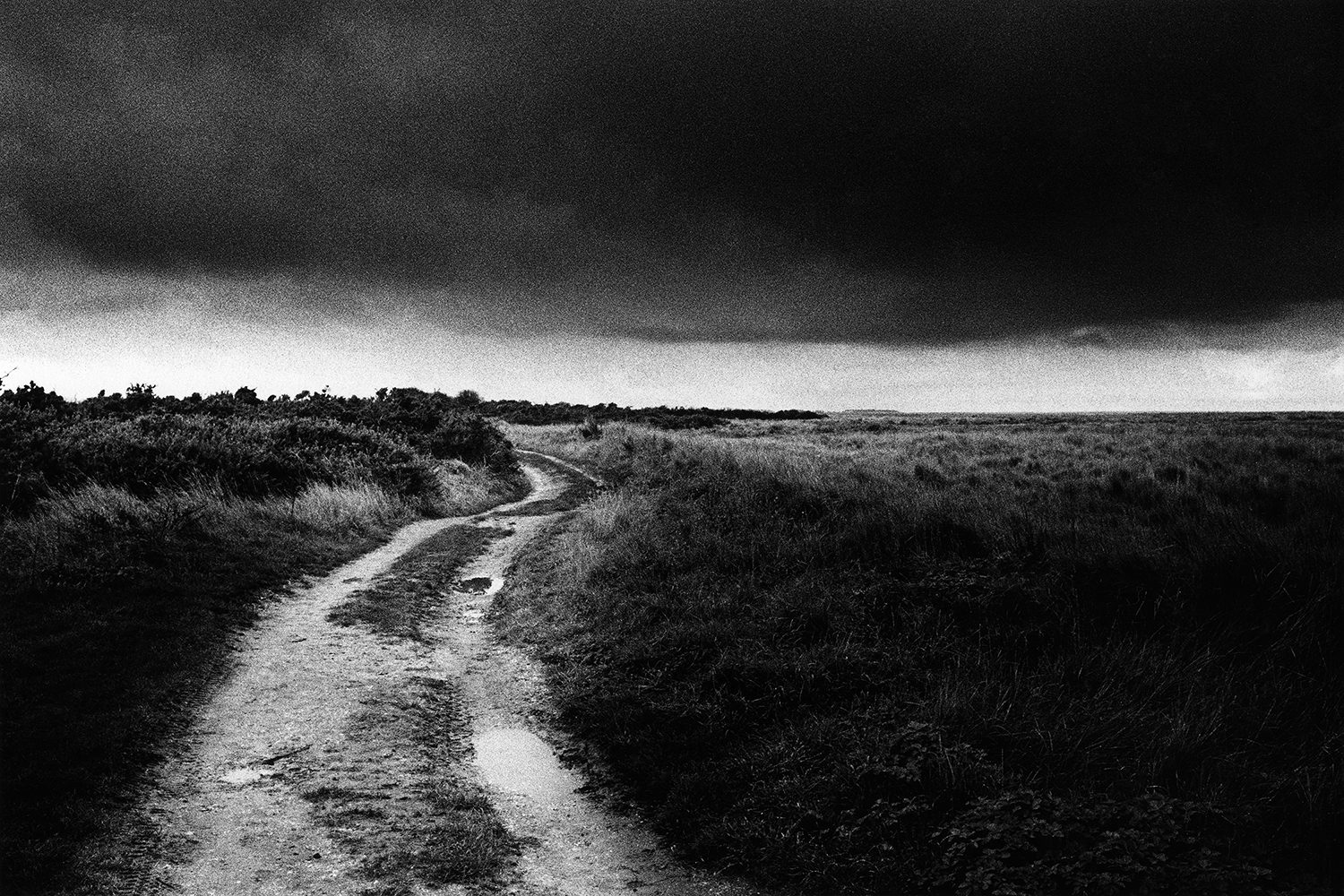
A Memorable Photograph: Sea Storm (2014)
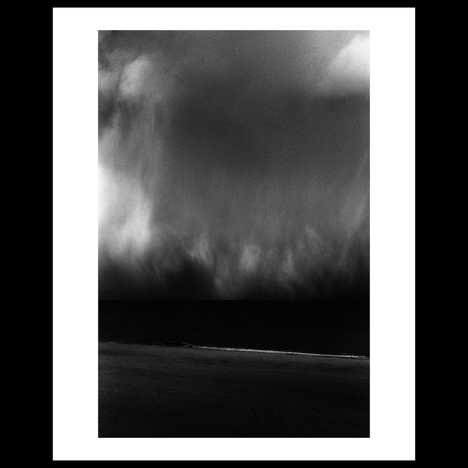
Sea Storm (2014) was a memorable photograph to take. I had just arrived at Winterton-on-Sea and as I clambered over the dunes to get a view of the beach, I was greeted by an almighty sea storm that was impressive not only by its size but also by its weight—the range of tone was astounding: I could see everything from dark purples and blues to golden highlights, where the sun’s rays were piercing the thick blanket of rain. Looking through my viewfinder, the sea storm appeared to be within reach, but it wasn't. It must've been playing out about a mile out to sea and it was moving fast.
So, back in the darkroom, and finding myself confronted with this negative, I cast my mind back and set about showing the two aspects of this spectacle that struck me the most: rich tone and a somewhat ambiguous depiction of space. The resulting print takes time for the eye to decode: starting in the grey swirl of the rain, the eye is pulled downwards, through the dark horizon, towards glistening wash of the waves lapping the shore. This photograph is the cover image for Where the Rain Clouds Gather and it’s one of my favourite photographs in the book.
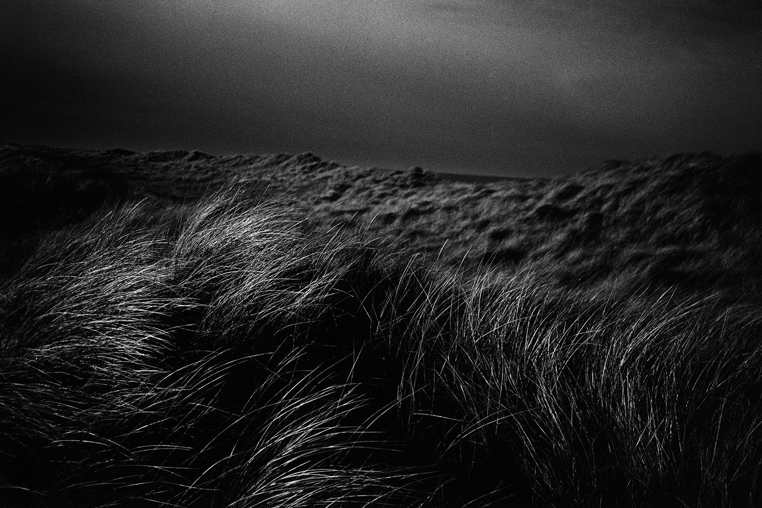
A Closer Look: Wash (2019)
I was sitting on top of a cliff, having a picnic with my two children, when I saw this scene. I grabbed my Leica M7 camera, which had a 135mm lens mounted on it, and took this shot. It was a split-second decision and almost instant reaction to what I was seeing: *click* and I was back with children, enjoying lunch. Several weeks later, after developing the roll of Ilford FP4+ film and making the contact sheet, I spotted this frame and began thinking back to the moment the picture was taken. I had to cast my mind back to the picnic atop a cliff and think about what made me trip the shutter. What initially pulled my gaze, I think, were the silhouettes walking along the beach, with the luminous slither of sea radiating light and the leaden sky passing overhead. What inland details the camera had recorded on the film were of no interest to me as I didn't care to remember them or indeed care for them to be remembered, at least not on this occasion — they ultimately detract from my subject: the sea and the sky.
The Book
The book will be printed using metallic ink on 135gsm black paper throughout. I’m very excited about this. It’s a deliberate choice to enhance the oneiric feel of the sequencing and to give a new voice to the work – for the photographs to exist together as a book, as a new object, as opposed to some kind of print catalogue.
Where the Rain Clouds Gather is currently available for pre-order through the publisher’s website, with orders scheduled to be shipped in early May 2021. There is a regular edition of the book available as well as four fast-selling special editions, comprising a copy of the book and a signed and editioned FB silver gelatin print.
To see more of the book and to pre-order, take me to Where the Rain Clouds Gather
Selenium-toned silver gelatin prints made with 16x20” Ilford MG FB Classic paper are also available directly from Open Doors Gallery in London in editions of 7.
About The Author
Kit Young
Kit Young (b.1984) set out on his photographic journey in 2009 when he moved to France where he joined a group of Paris-based photographers led by Gu00e9rard Moulin. It was during this period that Kit began to explore the infinite possibilities of darkroom printing and the juxtaposition of seemingly unrelated moments in time to create visual patterns as part of series-based work.
n“While I began taking photographs several years ago, I only started taking the medium of photography seriously when I discovered the hands-on nature of black-and-white film and what are now referred to as ‘traditional’ printing methods. For me, nothing else will do. The four sides of the negative are my point of reference u2013 they enable the viewer to see what I have seen.” u2013 Kit Young
nKit is a member of AllFormat, an international photography collective united by a mutual love of film.
nn
Website: www.kityoung.co.uk
nInstagram: @kityoung135
n