


How I Got this picture - Dave Kirby Posted On 3rd August 2017 To How I got this picture

Jokulsarlon Two
For our inaugural 'How I got this picture' post, we're talking to Dave Kirby about Jokulsarlon Two. One of the beautiful images in his Iceland series.
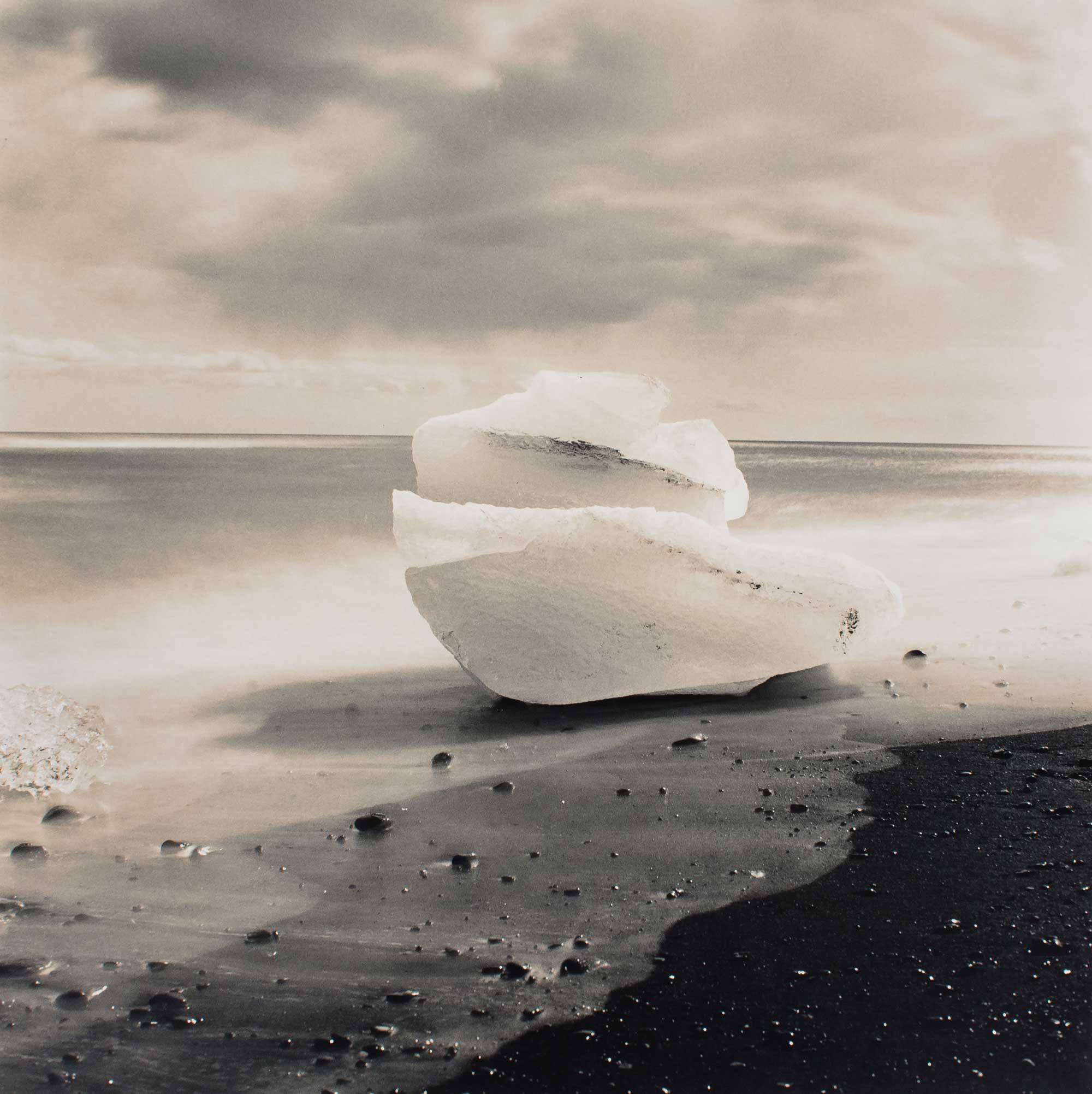
Jokulsarlon Two ©Dave Kirby
Film Used – ILFORD FP4+
Format - 120 film in 6x6 format
Camera - Bronica SQ-A
Lens – 80mm PS
Exposure time – 57s
Other equipment – The cheapest, naffest tripod money could buy (now broken), 10 stop filter, hat!
Location
Jokulsarlon, South Coast, Iceland.
Tell us the story behind this image. What inspired you to shoot it?
Jokulsarlon is an incredible, amazing place. Pieces of ice break off a nearby glacier and float across the glacial lagoon and out to sea where the waves then push them back to shore to beach upon the black volcanic sand. There were blocks of varying sizes and shapes scattered all over the shore and I just had to get to photographing them. This block was particularly well-sited because the water was just starting to reach it as I approached, meaning that I would have time to get setup and expose a few frames of film before the tide came in too far. We don’t get this kind of landscape in England so I was very eager to shoot at this location.
Did you come across any challenges?
Absolutely. The first challenge was finding a quiet spot on the beach where there was no threat of someone walking in front of the camera. Jokulsarlon is a hugely popular destination in Iceland and it is often packed with people. Fortunately, most people tend to dislike straying too far from the car, especially in cold places, so a quick walk up the coast found me the ideal quiet spot.
The next challenge was the tide. It was coming in and every now and then a wave would have that little bit of extra energy and come shooting inland much further than the previous one had. Keeping an eye on the waves and timing the exposure so that the whole of the foreground wasn’t water was key to ensuring that the image had the composition I wanted. Of course, with long exposures of water you can never truly know how the image will finally turn out, but I had a good idea of what I wanted. By the time I had finished shooting this ice block I also had wet feet – always pack spare socks people!
What process did you use?
Setting up the tripod and getting the composition sorted was the first step. It is important to make sure that the tripod is level and stable, especially when doing long exposures, and especially when on the beach as if a wave comes in and washes away the sand which your tripod is bedded on you have lost your exposure and maybe even your camera.
I knew I wanted to do a longer exposure so I dug out my 10 stop filter. I used a Pentax Spotmeter V to meter the scene and set the appropriate exposure, then went through the awkward steps of doing a long exposure on my camera. (The Bronica SQ-A, although it can do long exposures, does not make this an easy task – especially with cold fingers). With metering, the key was striking a balance between getting sufficient detail in the dark sand and maintaining the highlights of the ice and sea.
How did you process it?
The film was developed in Rodinal and ILFORD stop bath and fixer was used to complete the process. I like to use Rodinal because it lasts forever and strikes a good balance between grain size and sharpness. I have determined my own development times for ILFORD FP4+ based upon my own developing procedure and would encourage anyone who likes to experiment and get technical in the darkroom to do the same.
What about printing?
I know that some people like to scan their negatives but I’m definitely a printing man. You simply cannot beat the feeling of seeing the image appear on the paper in your developer tray, or of holding a mounted print in your hands after really working a negative to get the desired result.
Which paper did you use and what was your printing process?
The whole of my Iceland series was printed on ILFORD MG FB Classic paper in matt finish. I know that the glossy version of this paper gives deeper blacks but I just love a matt finish, plus it beats glossy finish when it comes to retouching.
With this image, I wanted to ensure that the white of the sea was not too light as that would make the highlights in the ice block look too dark and detract from the main subject of the image. As the base exposure of the print was determined by the tonality of the water highlights the tonalities of the other areas of the image were achieved by dodging and burning. A little burning-in was added to the sand at the bottom-right of the frame in order to darken them down somewhat. The body of the ice block also needed a little dodging to lighten it up a bit, and the sky needed to be darkened a little too
Huge thanks to Dave for kicking off this series for us.
You can find more of Daves images from his Iceland series as well as links to his website and social channels in the About section below.
If you would like to contribute to a future post in this series, then please get in touch.
About The Author
Dave Kirby
You can find my website at www.twelvesmallsquares.com – here you can look through my galleries, purchase prints and read the tutorials I write about working in the darkroom.
You can also follow me on Instagram at @twelvesmallsquares, Facebook as David Kirby or Twitter as @twelvesquares.