


Hand Colouring black and white prints Posted On 28th March 2017 To Expert Series

Hand colouring
The idea of adding colour to a monochrome image by hand dates back to the beginning of photography. At this time it was the only way to get a colour photograph.
Although colour photography using the three colour process was put forward just short of thirty years after the first photograph by Nicephore Niepce, it was, in its early years, expensive and difficult to produce a colour image. Hand colouring became a practical way to give the impression of colour and everything from Daguerrotypes, salt prints and lantern slides were used to make this kind of image.
Hand colouring photographs continued up until the second world war when it was superseded by the new Kodachrome, but various kits were still being marketed up to the fifties. It was very popular in Japan where it was highly respected in the mid 19th Century.
In the mid-seventies, it was revived in the UK as a bit of a novelty and appeared in some fashion work and also on record sleeves and book covers. David Bowie's Ziggy Stardust album has a hand coloured image on the cover, as do many others from around that time by Led Zeppelin, Roxy Music, AC-DC, The New York Dolls, George Benson and Dr John.
My first experience of hand colouring
I first saw examples of matt prints coloured with pencils in 1978 and was immediately intrigued. The work was by a Yorkshire photographer called Porl Medlock. After seeing it I wanted to try hand colouring but didn't want to copy Porl's work directly so decided to use dyes rather than pencils. My first attempts were rather heavy handed, and I was plagued with patchy colours. To minimise this, I diluted the dyes and built up the colours gradually which definitely helped to even out the colour, although it still needed careful application. My first prints were quite small, but I soon progressed to doing everything at 10x8 and found this an ideal size to work with.
Creative control
Around this time, I was becoming disillusioned with the quality of actual colour prints. I'd had some prints made for a college project and was less than excited about them. The sharpness that I could get from a medium format negative wasn't there on these commercial prints and the colours were either garish or pale and inaccurate. Consequently, this made me more interested in hand colouring as a way of getting the sharpness and having a more accurate and controllable colour.
After hand colouring several 10x8's I decided to go bigger and made myself a sharp 20x16 from a 5x4 neg. I then spent hours, carefully adding diluted dye with a small brush. As you can imagine, this is not a quick process. Working slowly and carefully on a large print takes a long time, but this is not a problem as I often find the experience very relaxing. The final result was very satisfying and I produced a few in succession that year. Two of them were reproduced as posters in the late eighties and sold all over the world.
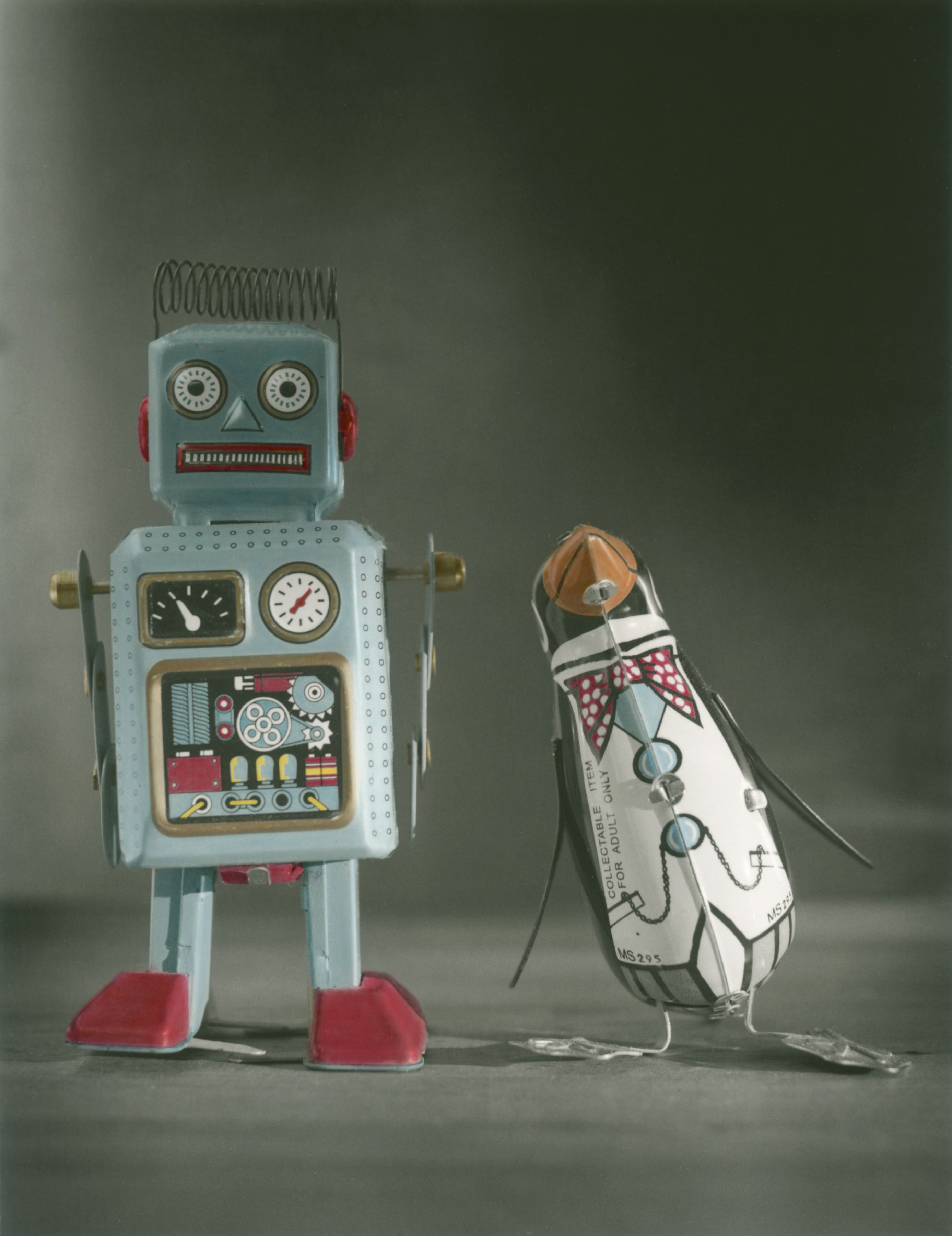
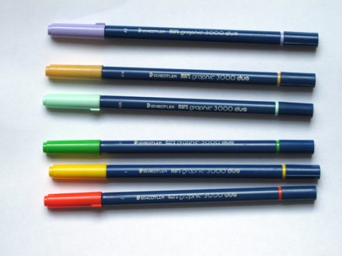
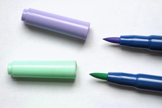
Hand coloured using diluted dyes from Staedtler brush pens
Print choice
All types of black and white (darkroom) prints will take coloured dyes and all matt prints will take pencils to differing degrees. The better the texture, the more the pencil has to abrade against.
Inkjet prints may take dyes, though you would have to test your own papers, it’s an area I’ve only experimented with a little. The problem I had was that the papers were designed to be absorbent and they soaked up the dye as soon as the brush touched the paper. This meant that it was impossible to get any spread and the colouring was extremely patchy. If inkjet is your only option for producing prints, try printing onto ordinary cartridge paper and you should get around this problem.
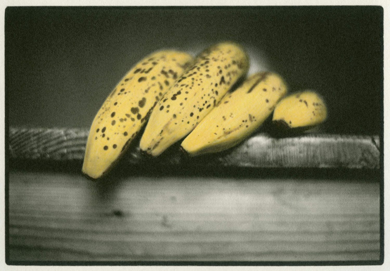
I scanned an old photo and printed it out onto a sheet of paper taken from a sketch pad. I then coloured it with dyes and when these had dried I added extra colour with pencils.
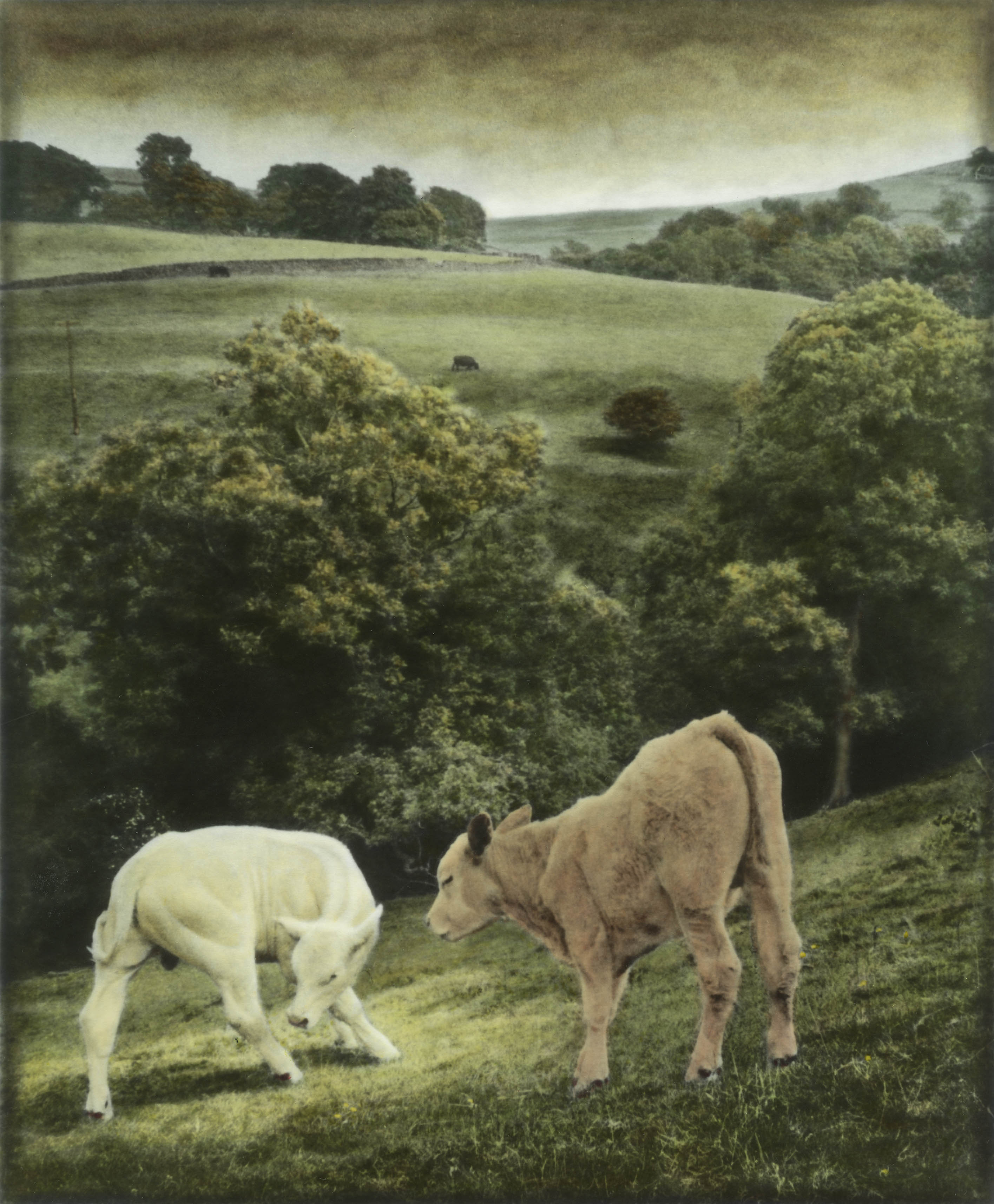
Two Cows by Andrew Sanderson
Preparation
Make sure you are well prepared before you begin your hand colouring.
The type of lighting that you colour under is important. Bright daylight is best, although full sunlight can strain your eyes when working close. Room lighting, whether tungsten or economy bulbs -which are effectively fluorescents -won't give you an accurate sense of the colour, therefore you will find that prints you have done look quite wrong when viewed in daylight.
Work on plenty of old newspaper because dyes are usually very strong and will not wash out if spilt. You will need a jar of water for diluting, and for washing your brush between colours. It is also useful to have a few pieces of kitchen towel nearby in case any excess dye needs dabbing off the print plus a clean piece under your hand to prevent greasy marks from your skin getting onto the print surface. Greasy areas will repel colour.
Finally, have an old dish, or a white plastic margarine tub lid to mix your colours on and put a small droplet of washing up liquid on the side. A tiny amount of this will need to be added to each colour you mix up to ensure an even covering.
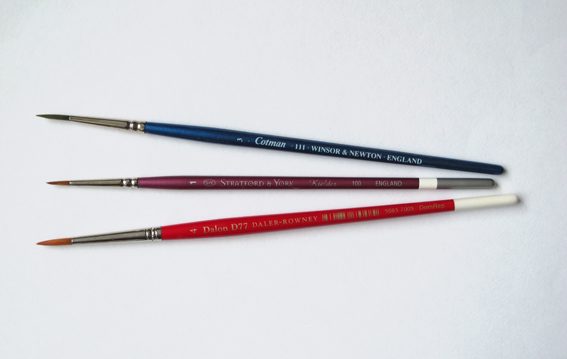
Equipment
Good brushes are essential. Old, tatty brushes will not give you control over the spread of the colour and your work will look messy. If you are working at 10x8 size then you will need a number 1 for fine work, a number 4 for most areas and a number 8 for large areas such as sky. Winsor & Newton Galeria are ideal.
Using the colours
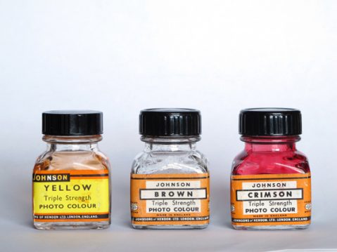
As I stated earlier, dyes must be diluted before using. How diluted is a question that is hard to give a prescriptive answer to. Some colours can be very strong and intense, whilst others are weaker, -so the dilution is different. For instance: when red is diluted it often looks pink, so it may need to have a little yellow added. Greens and blues are generally the same when diluted but beware of using only one shade of green for foliage. Trees, grass and plants all have different greens.
One of the greatest difficulties with hand colouring is to achieve an even colour over a large area such as the sky. The technique that works for me is to wet the area thoroughly with a large brush with a little soap added to the water then dab off the excess water with paper towels. Immediately apply the colour, moving it around all the time with a large brush. Skin tones can also be tricky to get right. Have a colour image of skin nearby as a reference and use a spare print to try the colour before committing to the final one.
Don't worry if you can’t get your print coloured completely in the time you have available. Adding a little water to dried up dyes will revive them so you can continue colouring at a later date.
Using pencils
Pencils are great for hand colouring but they need a matt paper. They also obscure the image if applied too vigorously, so photographs with a lot of detail a may be unsuitable.
An application of dye, before applying pencils to rough paper will prevent the colour sitting in clumps in the surface of the print. A very good darkroom paper for this type of work is the ILFORD Multigrade Art 300 paper
About The Author
Andrew Sanderson
One of the UKu2019s leading Photographers and a master printer, Andrew has writtenu00a0the definitive book on Night Photography: A Practical Manual; the highly acclaimed Home Photography: Inspiration on Your Doorstepu00a0and is a regular contributor to photographic magazines in the U.K.
nHe is an ILFORD Master Printer, and regularly gives workshops to university tutors, students and private individuals.
nAndrew is recognised as the leading practitioner of the paper negative process and one of the worldu2019s best hand colourists. Examples of both of these techniques can be found in his third book; Hand Colouring and Alternative Darkroom Processes.
nFor more information on Andrew, please visit his websiteu00a0and follow his blog
nHe can also be found on Instagram
n